Project Overview
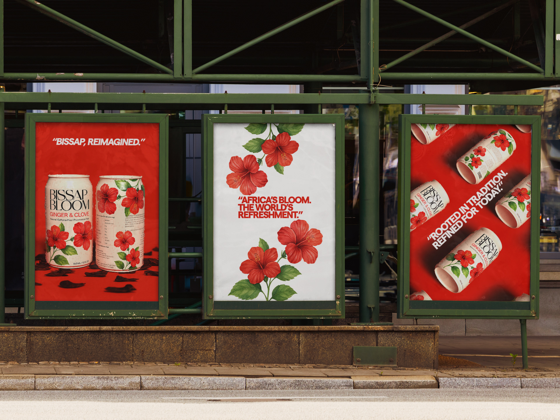
Bissap Bloom is a premium beverage brand inspired by sobolo — a beloved West African hibiscus drink. This design project reimagines the traditional recipe for a global audience, blending deep cultural roots with elevated, minimalist aesthetics to position the product as a botanical wellness drink on par with high-end teas and cold brews.
Design Goals
Celebrate African heritage without relying on overused visual tropes.
Elevate sobolo (Bissap) to sit confidently on shelves beside global wellness brands.
Balance modern minimalism with organic, nature-inspired visuals.
Visual Identity
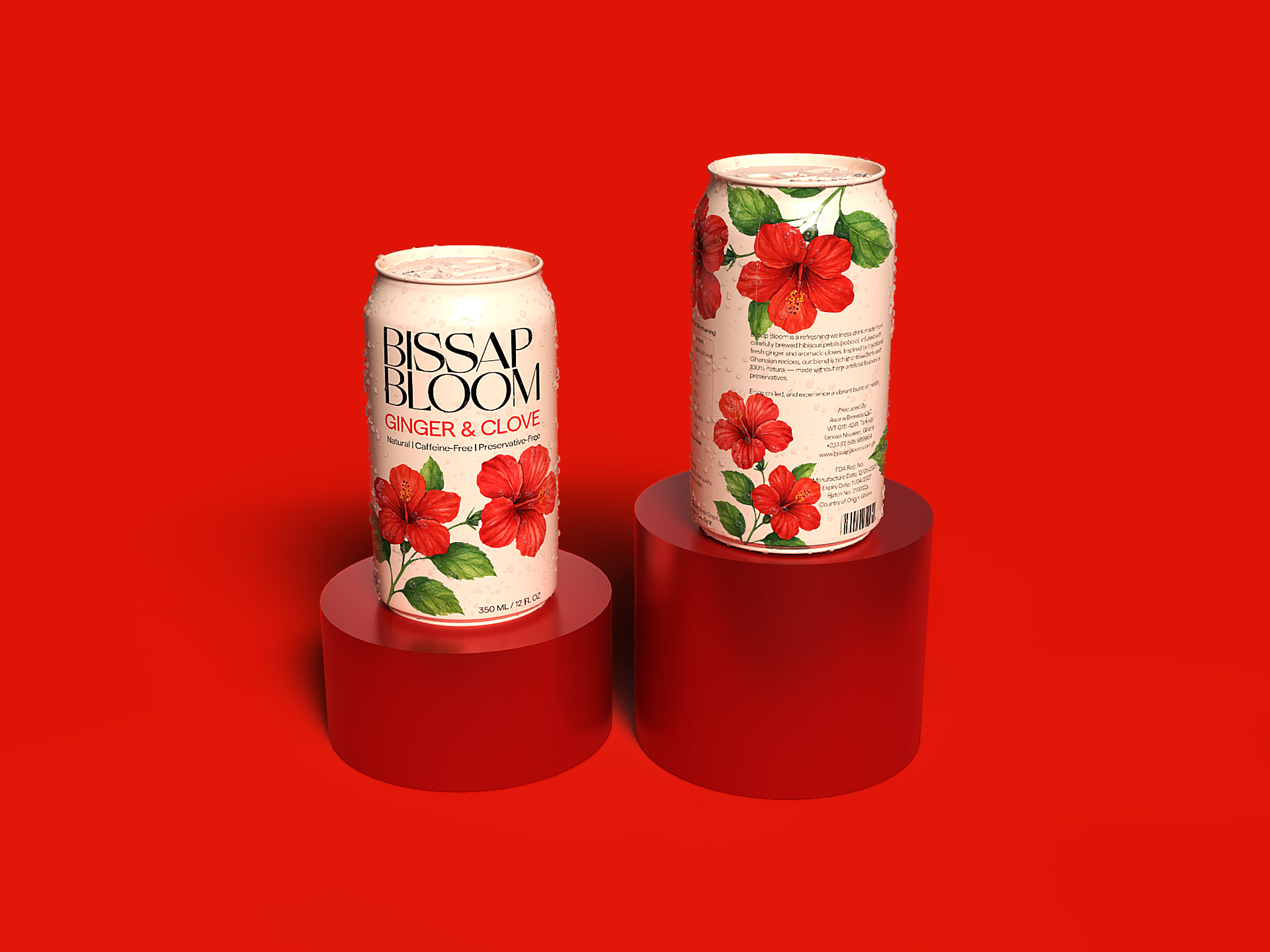
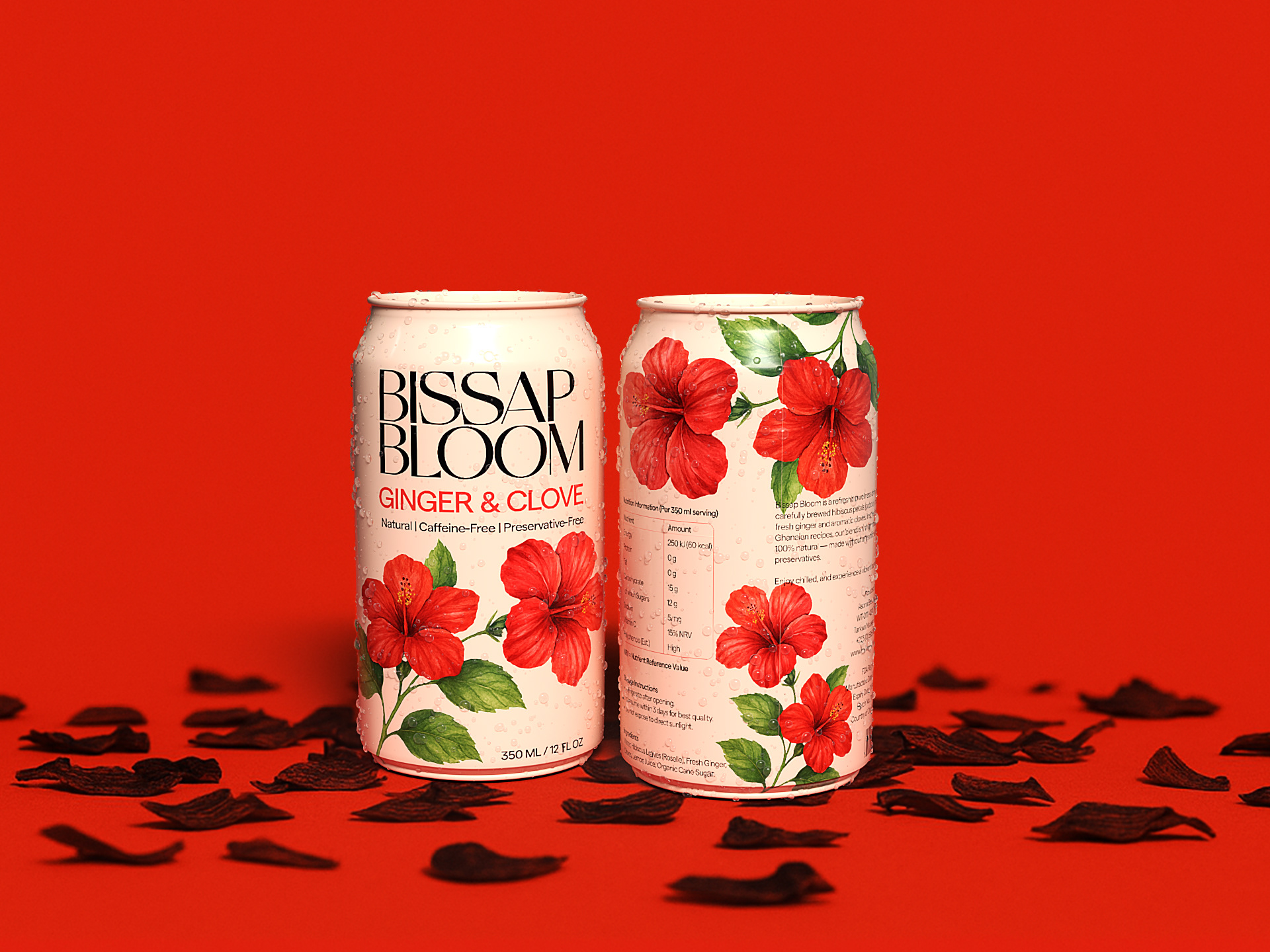
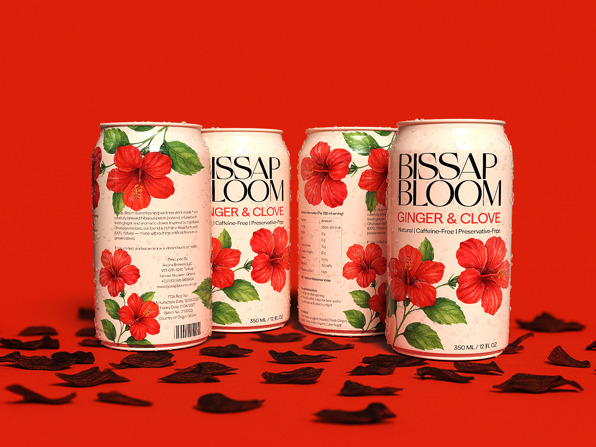
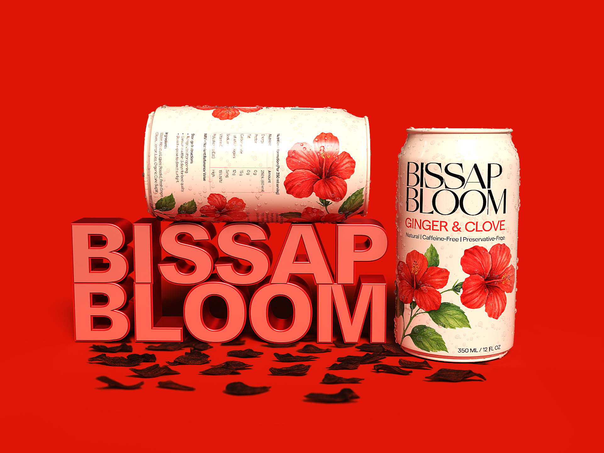
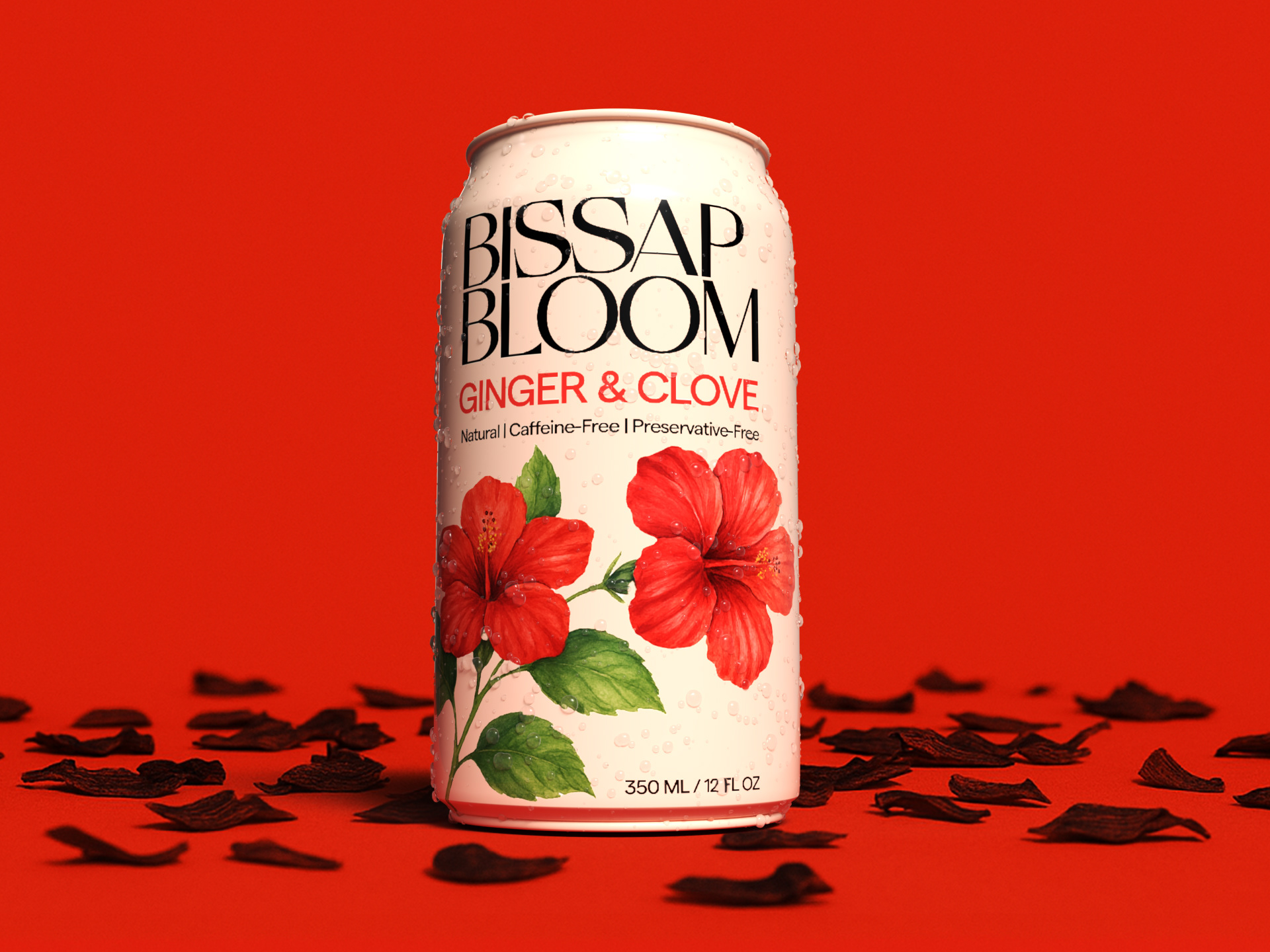
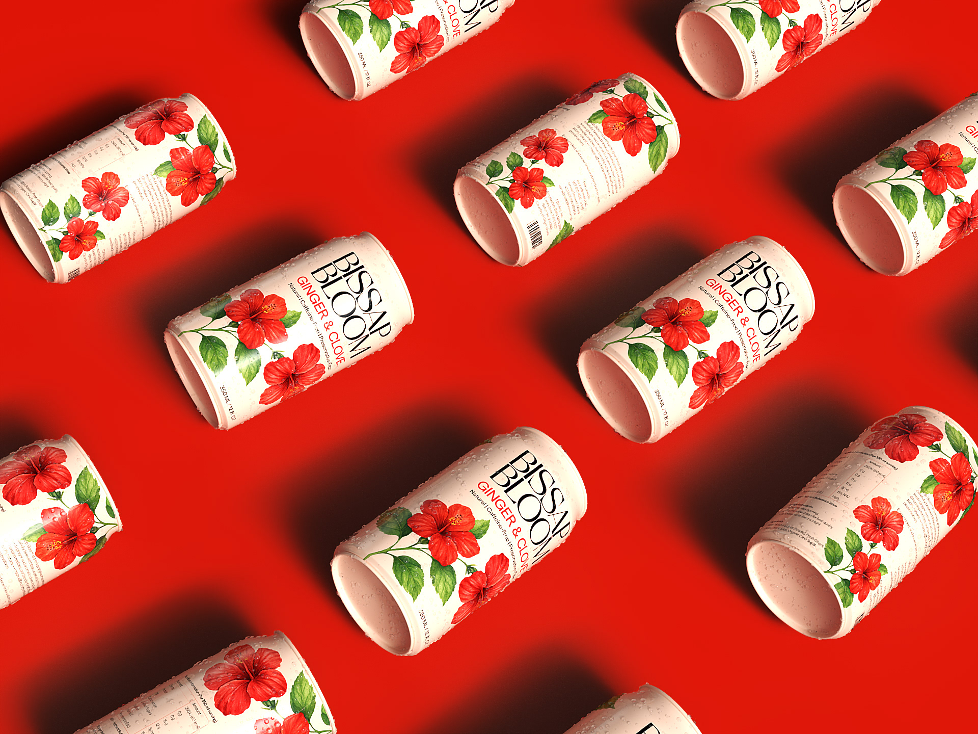
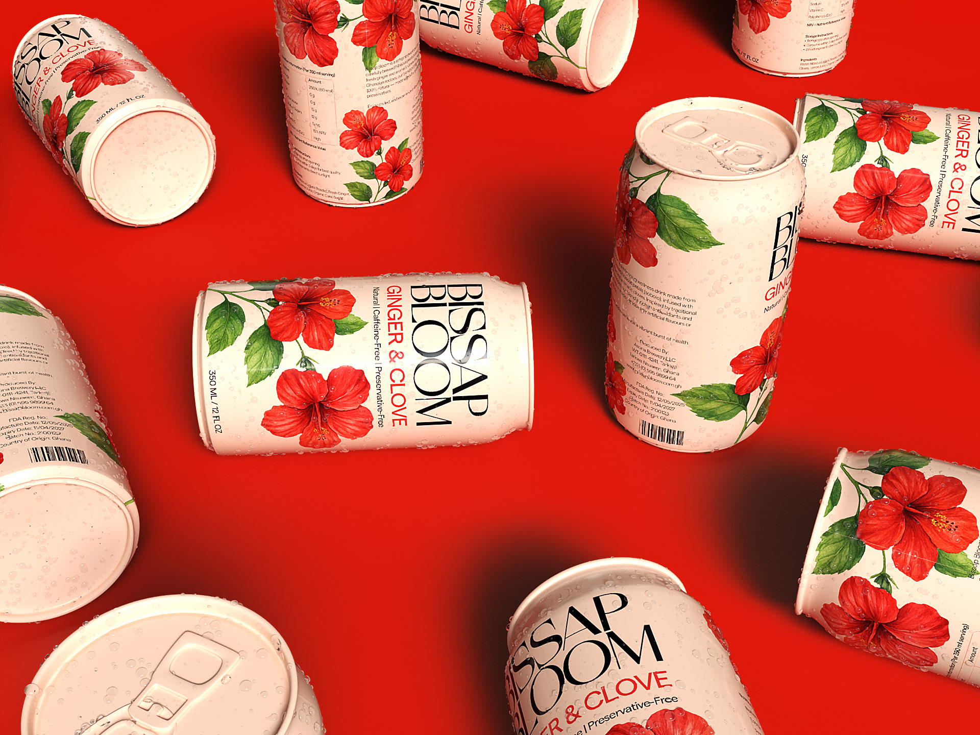
The logo features clean typography that expresses confidence and sophistication. The name Bissap Bloom evokes both the botanical source (hibiscus, or “bissap”) and the blossoming of culture on a global stage.
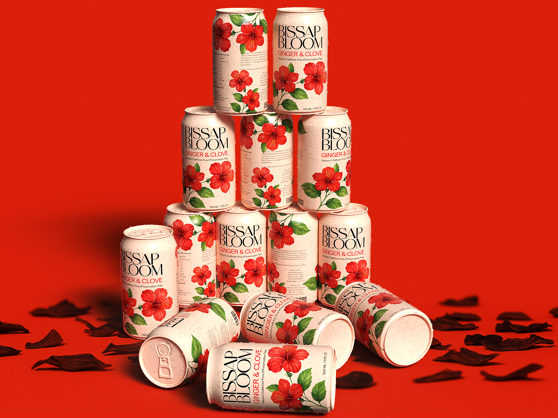
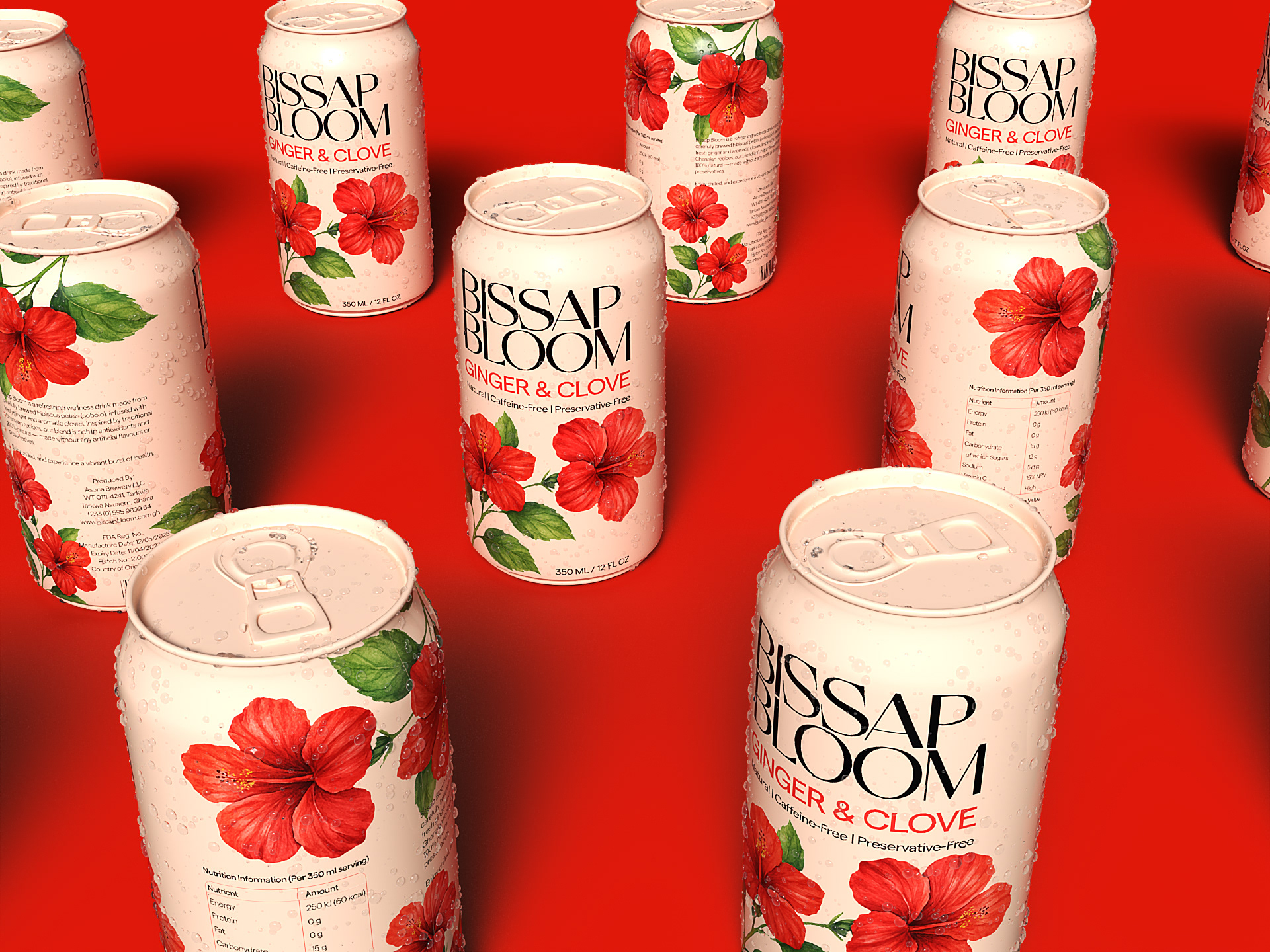
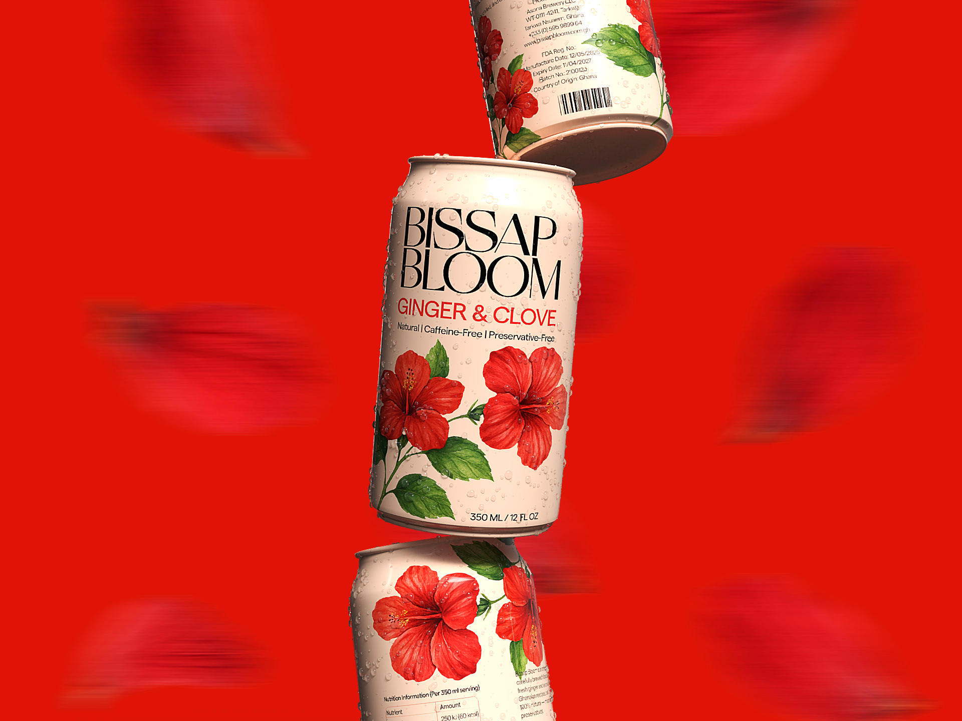
Color choices revolve around deep crimson and natural off-white, enhanced with vibrant botanical illustrations. done in water-colour to reflect the organic nature of the ingredients.
Packaging Strategy
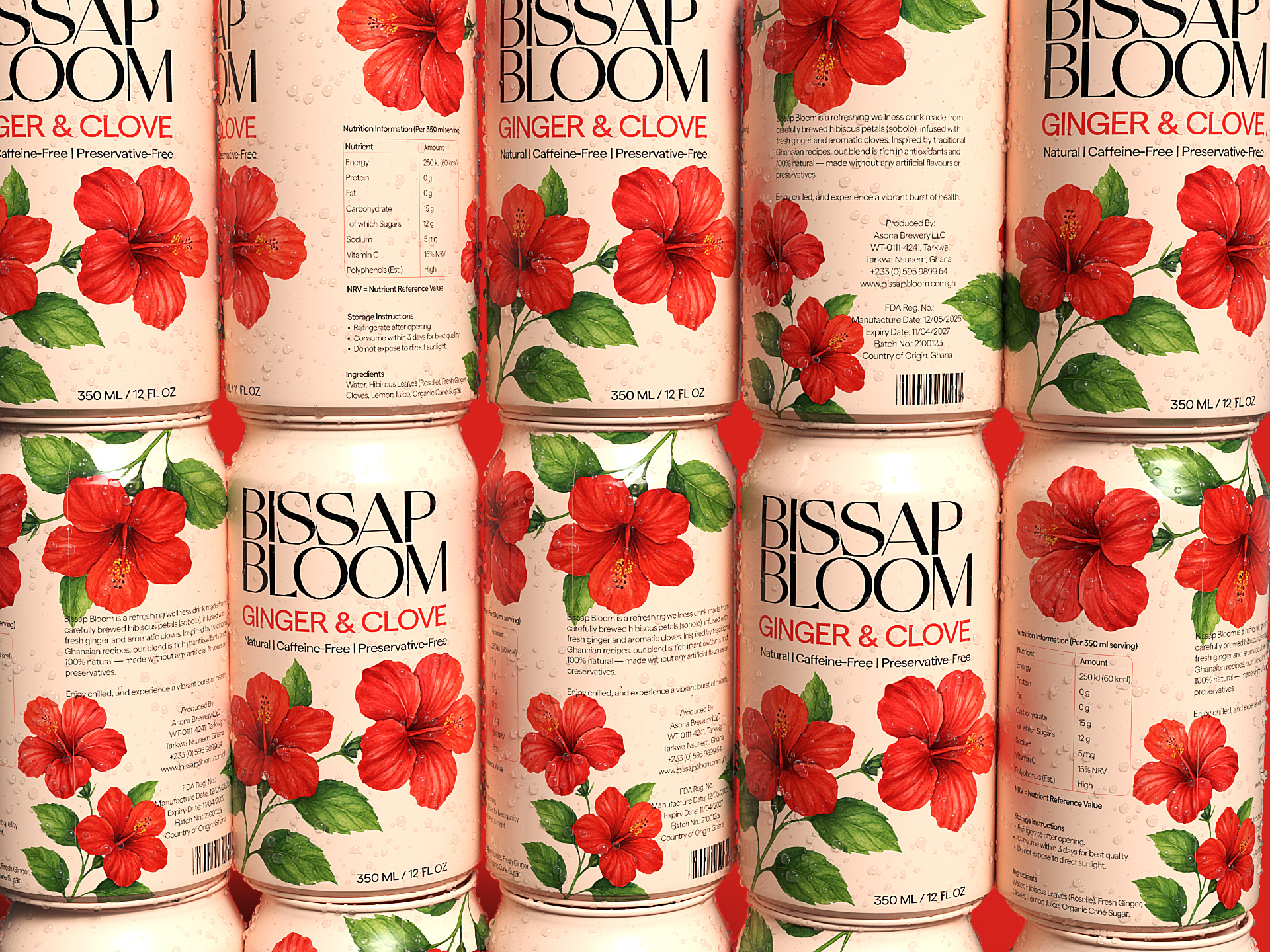
The can is designed to stand out while maintaining an understated luxury feel. Minimal front-facing content, matte finish, and subtle floral illustrations create a sense of calm refinement.
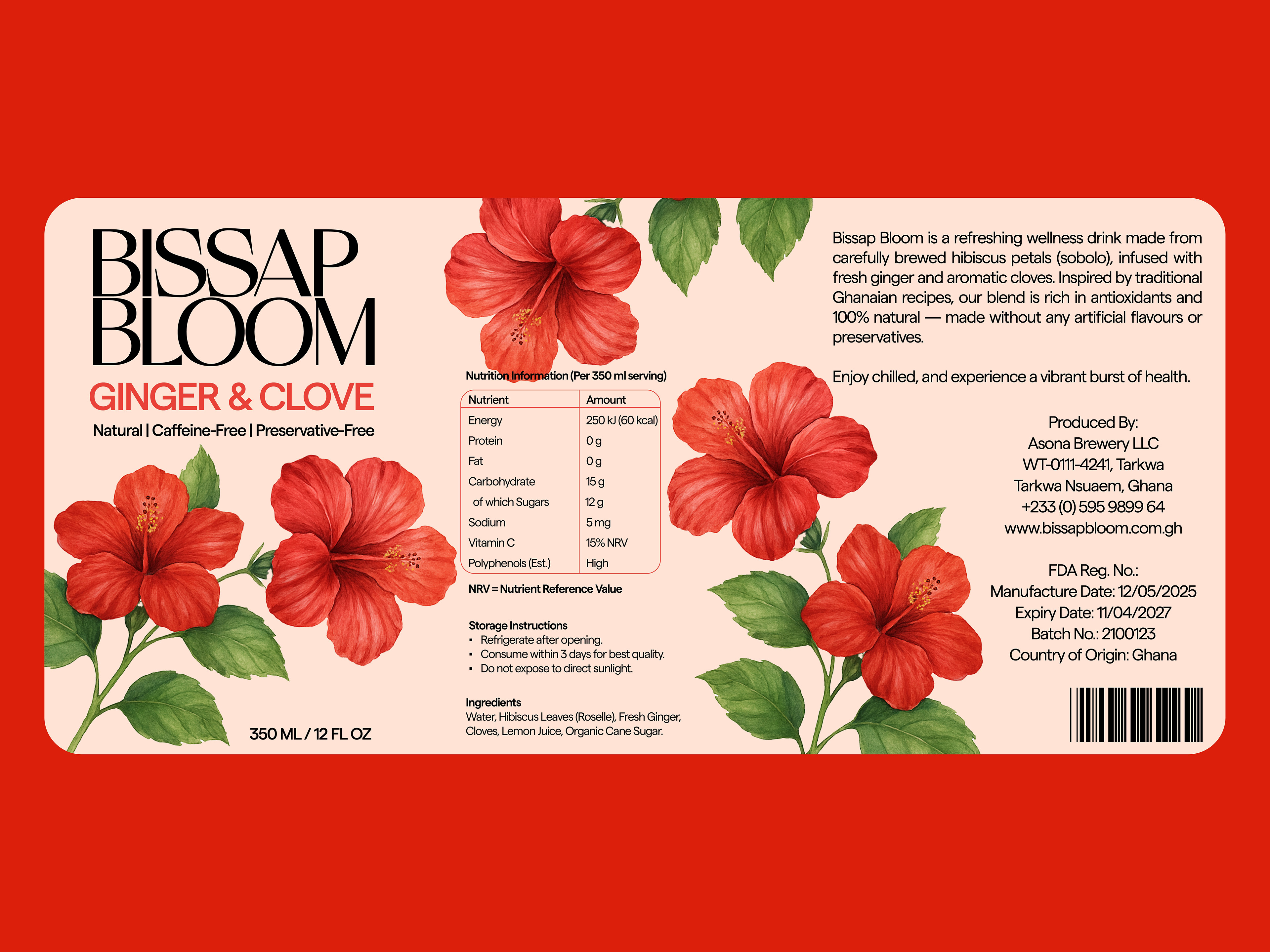
On the back, thoughtful storytelling and clearly presented nutritional info cater to health-conscious consumers and honor the drink's West African origins.
Outcome
Bissap Bloom bridges the gap between heritage and modernity, local and global, tradition and innovation. This concept demonstrates how culturally rooted products can be repositioned for upscale markets through smart, sensitive design.