Pizzaman Chickenman is a sub brand of CEQA Food and Beverages. It is a fully owned Ghanaian company which aims at serving the people of Ghana and Africa with the best of meals. It is their vision to be the first and leading fast food chain in Ghana and West Africa at large. The aim is to make quality, organic and tasty food accessible and affordable.
Brand Problem
The brand has two separate names and logos designed for two separate products. A brand’s name and logo are used to identify a brand as a whole. Having two separate names and logos for a brand makes it difficult for your target audience to relate to you, especially when a potential consumer sees it for the first time. The consumer will identify with only one product instead of the whole brand.
Consumers of the brand had a view on the packaging as it was too dull and obsolete. The brand’s packaging does not differentiate from its competitors.
Brand Solution
Logo Design
The purpose of redesigning the logo was to create a logo that easily identifies the brand as a whole.
Concept
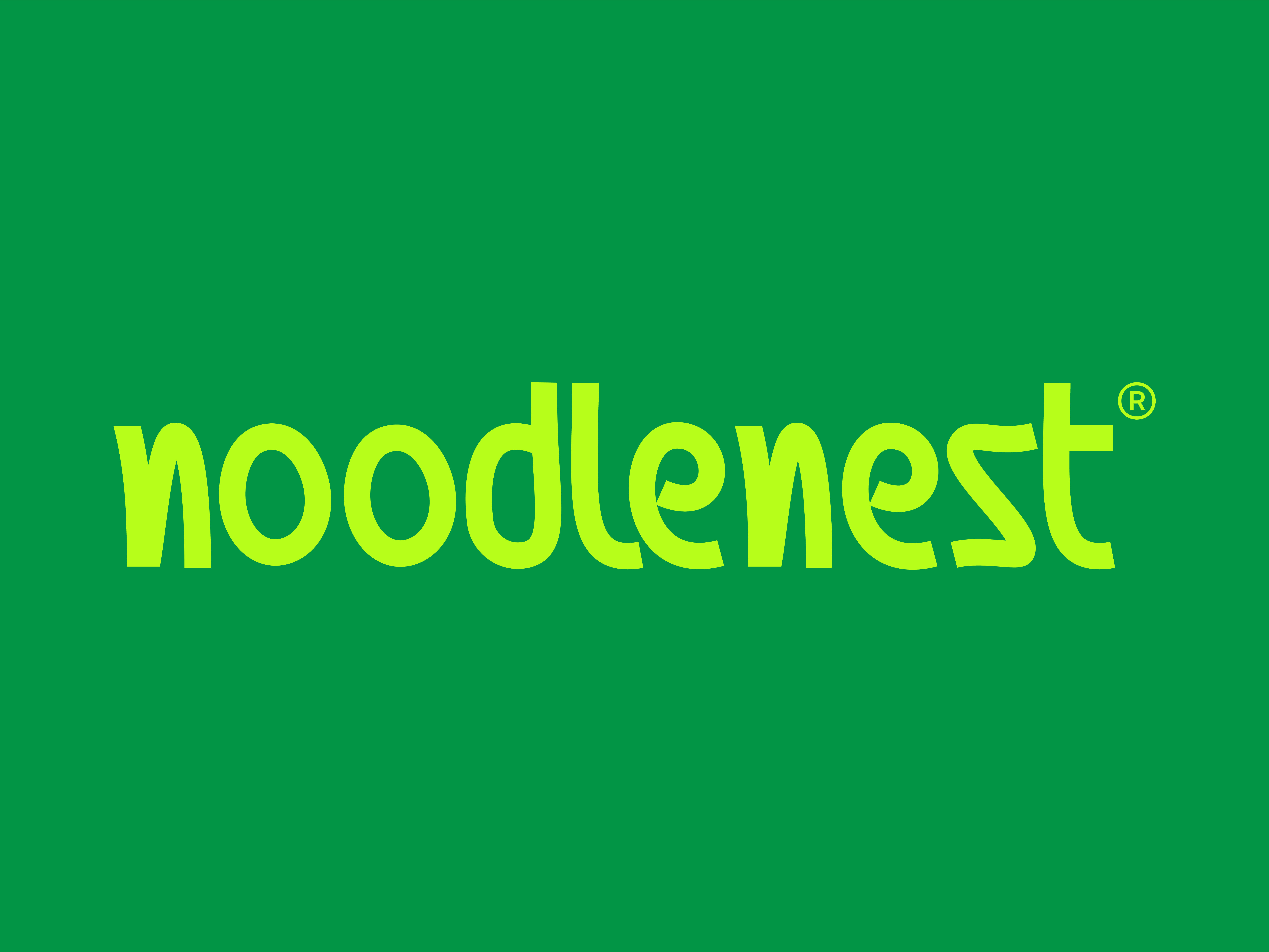
A brand having two names, a logotype was the best type of logo to create. The logotype is a hand-drawn typeface that portrays an organic character. The concept combines the two names into one, which can be applied to all touch points of the brand.
Packaging Design
The purpose of redesigning the packages is to differentiate the brand from its competitors.
The packaging designs adopt minimal, organic, and modern characters and pizza ingredient illustrations. The illustrations give the packages an original and professional look and feel.
For enquiries, contact me via
nanakwandoh12@gmail.com

